Simplify the file conflict / overwrite dialog (redesign)

i think you’ve done some good work here distilling the various inputs.

proposal 08 with the center justified columns on each side looks best to my eye and i would prefer the two line output for reasons i’ve stated previously, but a single line “verdict” with bolded text is better than nothing.

the goal is to avoid having to actually READ the texts once you become familiar with the dialog.

i still have a few of questions tho:

first.
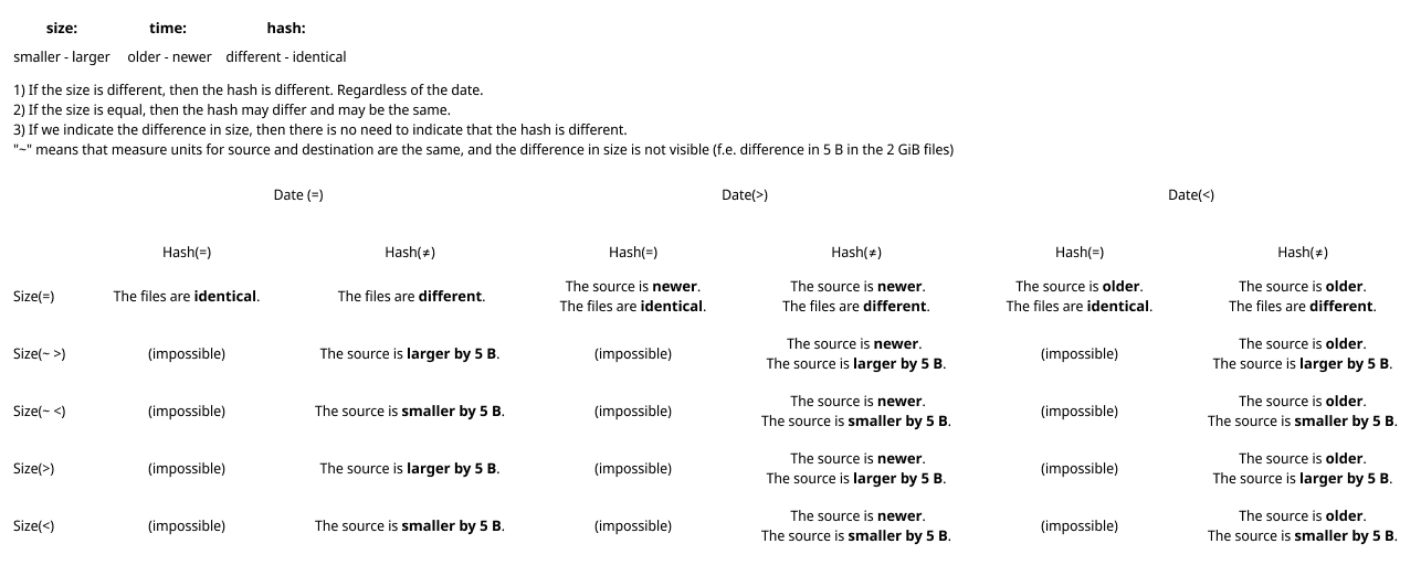
this hash comparison is new (to me at least) and i’m wondering if there is a performance hit making that comparison in addition to the timestamp and size calculations… and i’m still a bit confused about how you would have a different hash without a different timestamp, is that really a thing?

second.
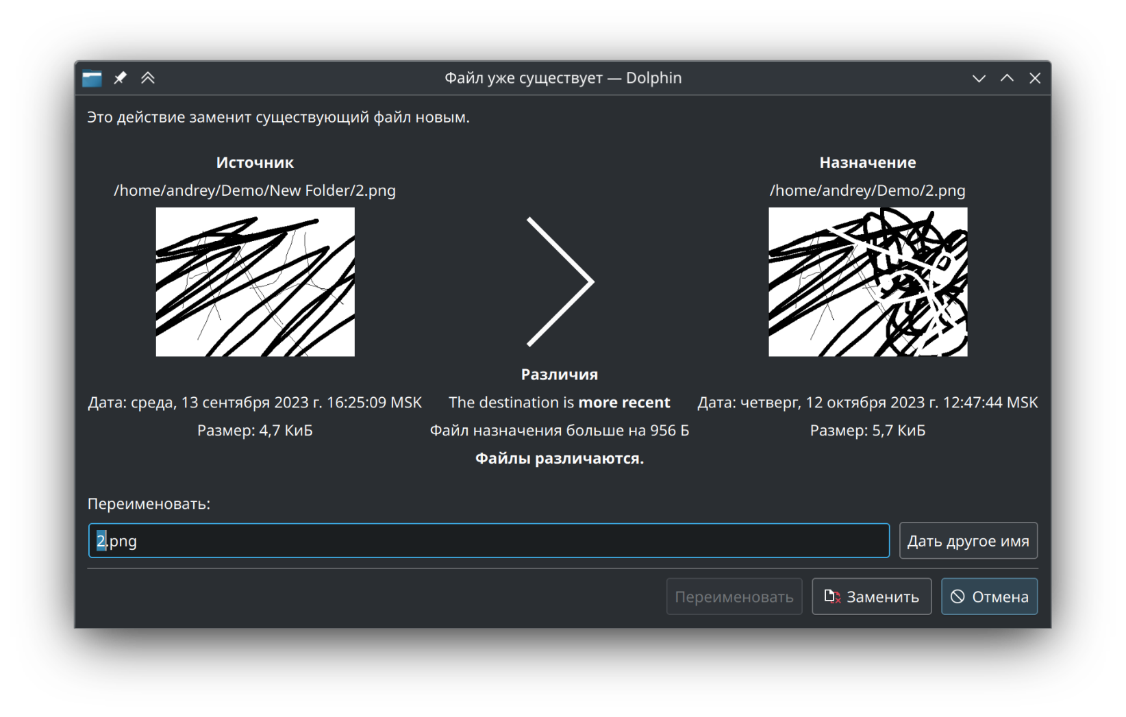
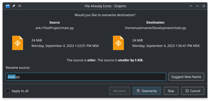
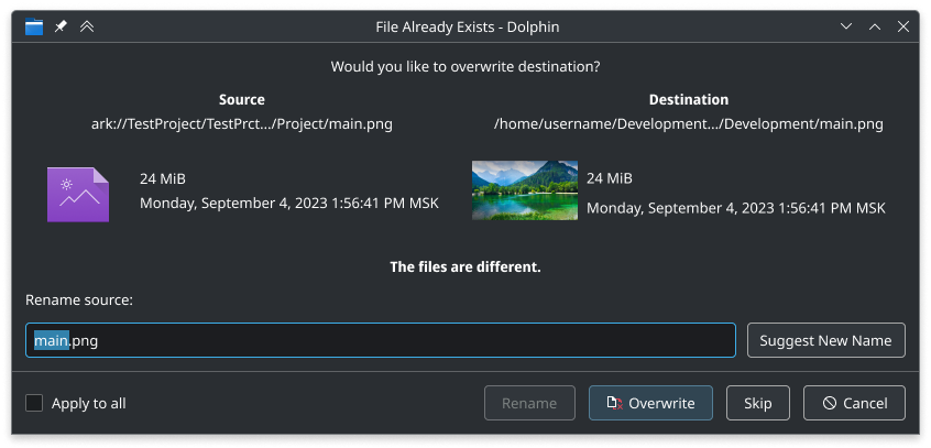
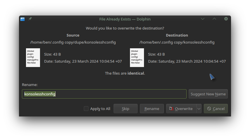
as for the default action, i’m guessing it is fixed on overwrite given the text at the top and all the variants showing overwrite as the highlighted action… is there ever a situation where it would make more sense for the default to be either skip or rename?

third.
as for the button order, my neurodivergent side keeps twitching at the order of those buttons… i prefer a most > least significant order of action so for me the button order should be
[ Rename ] [ Overwrite ] [ Skip ] [ Cancel ]

forth.
the apply to all check box is a bit of a blunt instrument when it comes to potentially different verdicts among the rest of the selection, so should this check box only apply to matching verdicts in your table or would it apply to the entire selection, which may have different verdicts that the user would want to consider separately? and if the latter, is that wise?

1 Like

It is not new, it is done currently, and I did not touch the code that does this. Probably, you did not noticed that if for example, you extract from Ark (it currently does not provide the source size, which causes that verdict is never shown).

Why not? Imagine, that I manually edited the modification time with touch command.

Probably, but lets discuss this later in another thread. Currently, we are only redesigning the elements placement.

Ok, looks like placing Skip near Cancel makes more sense.

I think it is applied to all next possible conflicts, despite the different verdict. But again, if that logic is a subject to discuss, lets discuss it later in a separate thread. Currently, I want to just redesign dialog’s “composition”.

thanks for your answers, makes sense.

To conclude everything, I have prepared a final mockups:

  • Moved Skip button next to the Cancel button
  • Fixed the order of verdicts. The order is: date difference, size difference, hash difference.

Here is a table of all possible verdicts combinations. (Fixed the previous table, we still need to write size difference even when measure units are different).

As you can see, we do not have any situation in which there are three verdicts, that could be seen with current dialog:

Case A (approximately same size):

Case B (presizely same size):

1 Like

Wanted to let you know Redesign rename/overwrite dialog (!1464) · Merge requests · Frameworks / KIO · GitLab by @Ashark got merged.

This is how it will look now:

Thank you @Ashark

6 Likes

Ah, the name @meven reminds me that I can now middle click to open my files with an alternative (second option)… just view, or edit - just play or add to playlist? It’s a massive extension :smiling_face_with_three_hearts:

Today’s issue

  • forcing hand to mouse, move window, click a ‘down’ arrow…

Is this more of an issue with KDE dialog boxes, or is it specific to individual projects?

The recent task of moving .config to .config-plasma5 and logging in again, then going dual-pane Dolphin and troubleshooting/restoring configs.

We’ll go with a half split technique and select HALF the old config and copy it across… then log in again to a fresh start each time restoring or removing ‘half’ a screen of config folders, before zooming in when issues return.

So now the first thing we see is that touching a key (like S to skip we actually messed with the filename now…

We MUST press ALT to get accelerators - but then it’s actually a bit of a pain to go ALTY 'Apply to All rather than just press ‘Y’.

We must also be careful to press TAB to get off that field, and now I want to Overwrite Older files… how to do this with keyboard?

It struck me that it’s more logical, with a focussed dialog box (Cancel selected) to press CSR to cancel/Skip/Rename. To OVERWRITE then pressing O should bring up the options All or Older files only.

I’m not sure why, but someone just pointed out to me that they get ‘Yes, Cancel, No’ options in Windows - they can just press YNor C to push those buttons from the keyboard.

Can anyone explain why we can’t do this?

We could press R for Rename then type.

Cancel preselected as the default failsave, we can then press ‘N’, or ‘S’, or R/W…

O should trigger a dropdown list for options:

AOverwrite All
OOverwrite Older
NOverwrite Newer
BOverwrite Bigger
SOverwrite Smaller

So without ALT would be MUCH better, but if pressing Alt, then just dropping down the Overwrite menu would be cool.

I would suggest opening a new topic for new proposals, rather than writing to the existing one.

3 Likes

@Ashark, I think your design is a lot more compact, and not least because of that, easier to parse. I’d be glad to see that in its depicted from replace the current dialog.

However, I shall note that I have always found it strange that the dialog doesn’t merely render a table. That seems like the most immediately evident way to present differing but comparable information in a manner which can’t cause confusion.

2 Likes