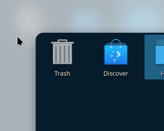
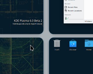
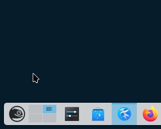
Here are screenshots of the new overview’s corners, top corners of applications (Kate and Dolphin) and the floating Plasma Panel:
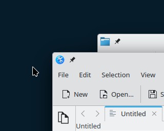
PS: I think the slightly rounded corners in the last two screenshot really look OK and acknowledge some design trends (as bad as they may be) without taking it too far.