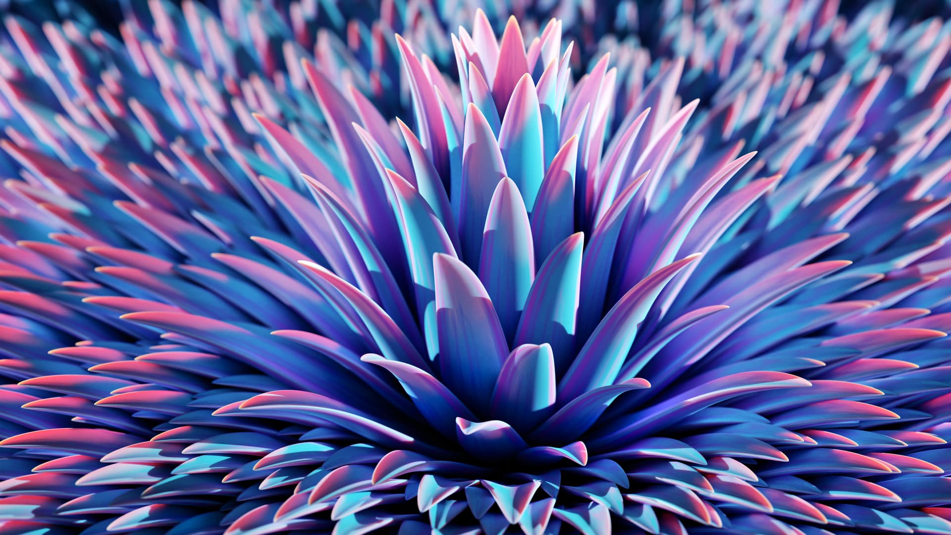
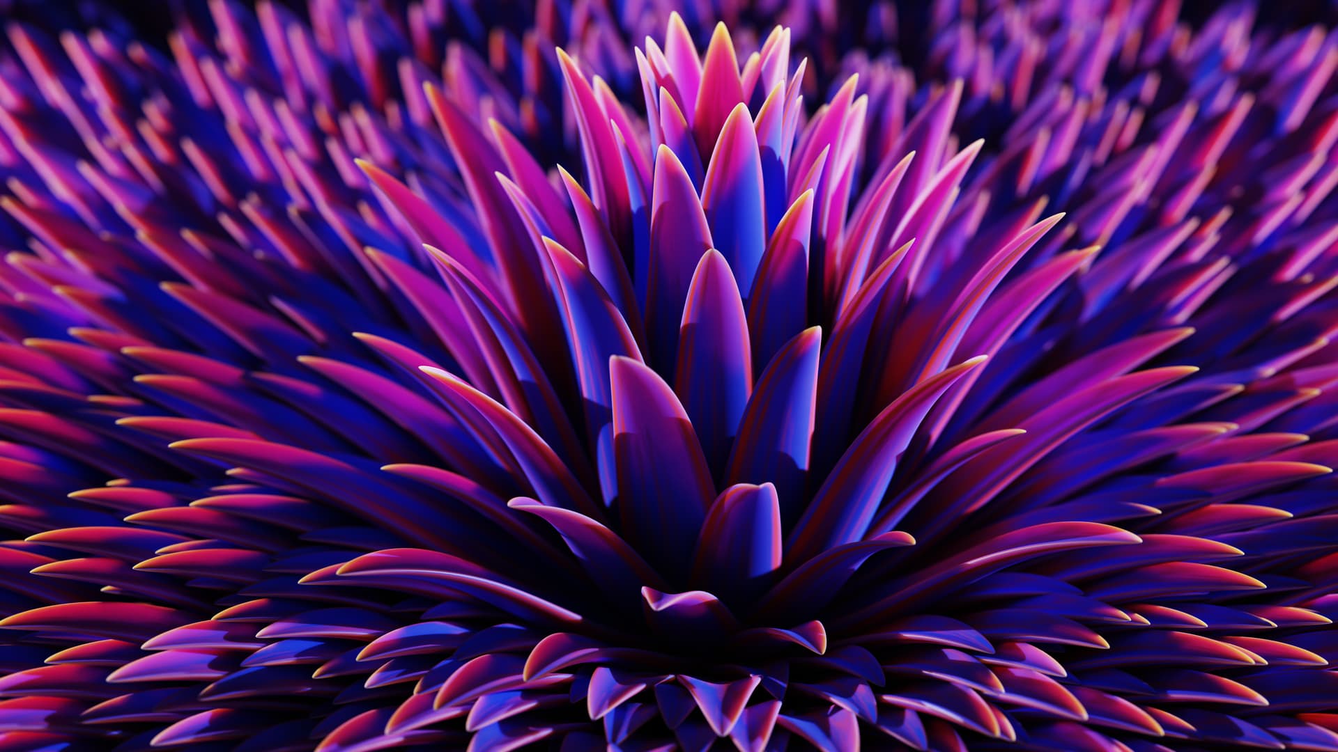
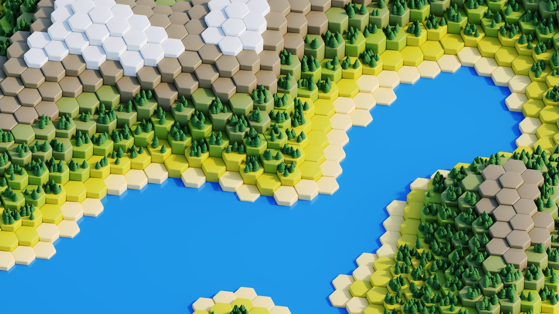
In my humble opinion, “flower” and “hexworld” are the prettiest.
I like how flowers colored, especially at the edges.
Rim lighting is cool on petals, and so is their shape.
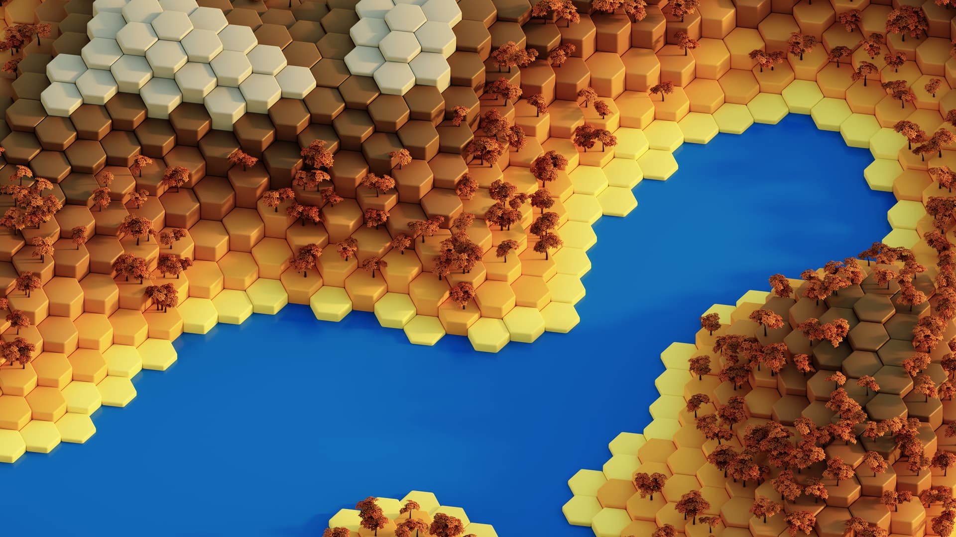
The hexworld looks almost like a neat toy of sorts.
And, I like gradients of colored hexagons in there.
And, here’s my humble opinion on the other 3…
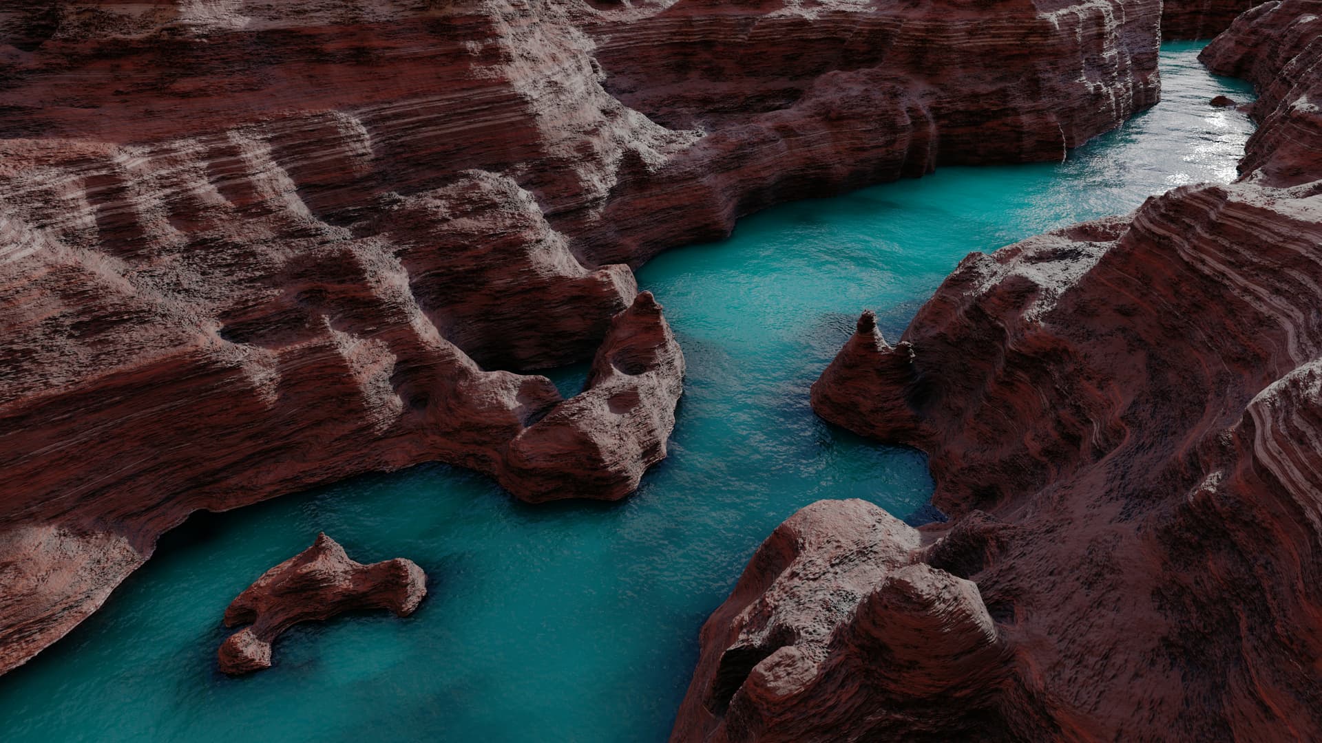
I think that canyon is a neat idea.
However, currently it looks rather artificial.
I see noise texture on the water, as well as the ground.
I don’t see either a photo or nice style in these things.
I also don’t like how dark version is handled for canyon.
Shadows are super dark, but on water still bright reflection.
Also, why is it white? I don’t think that Sun is of this color.
If you’re using Blender, e.g. “Sky Texture” is useful for sky/sun.
And looking at some photos as well as tutorials, may be wise.
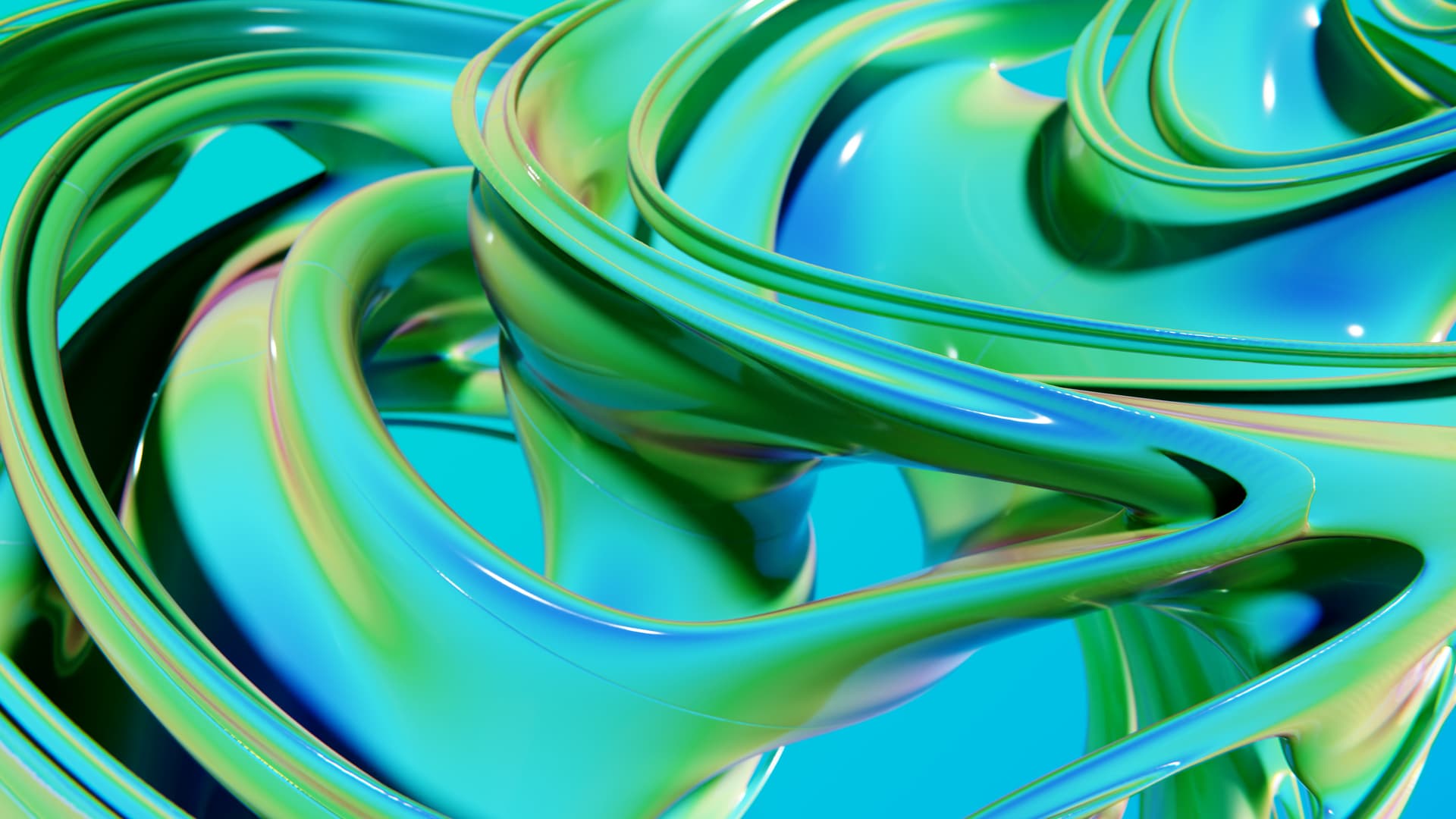
Julia looks like moment of paint splash to me.
It’s colorful and have pleasing smooth shapes.
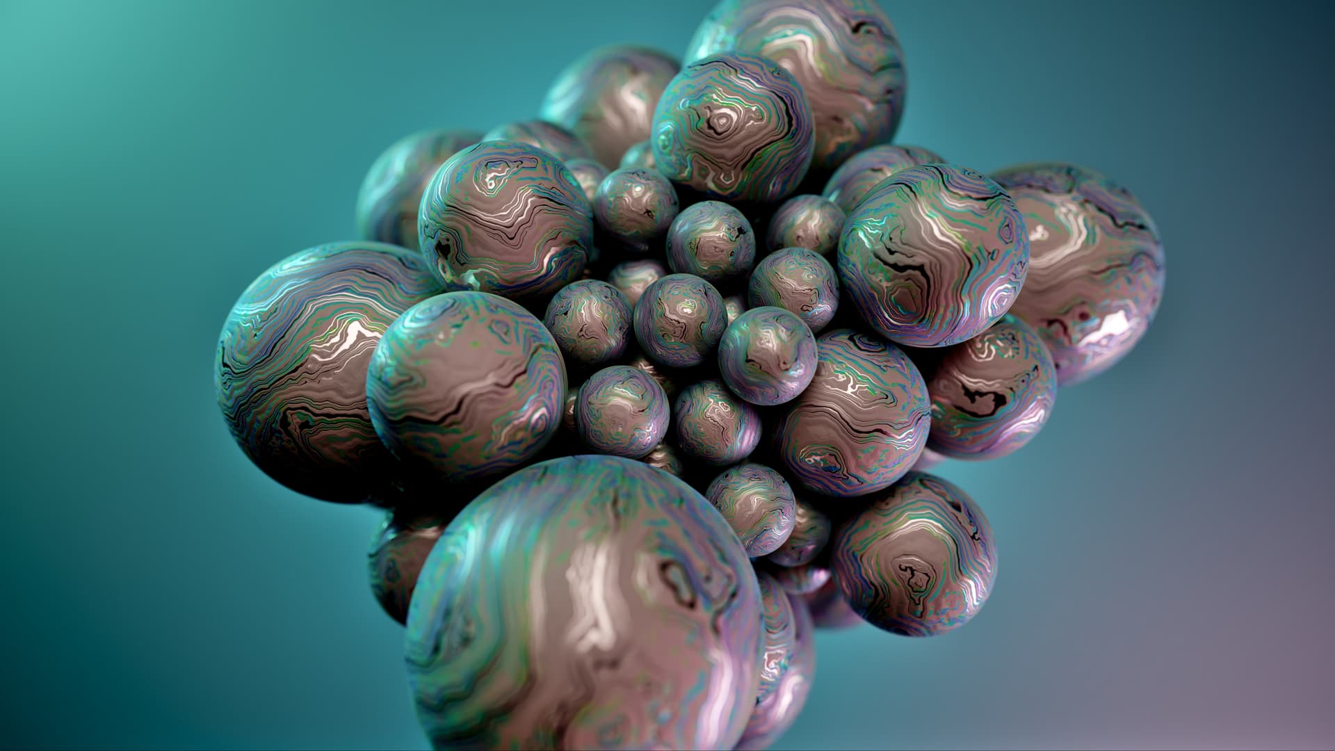
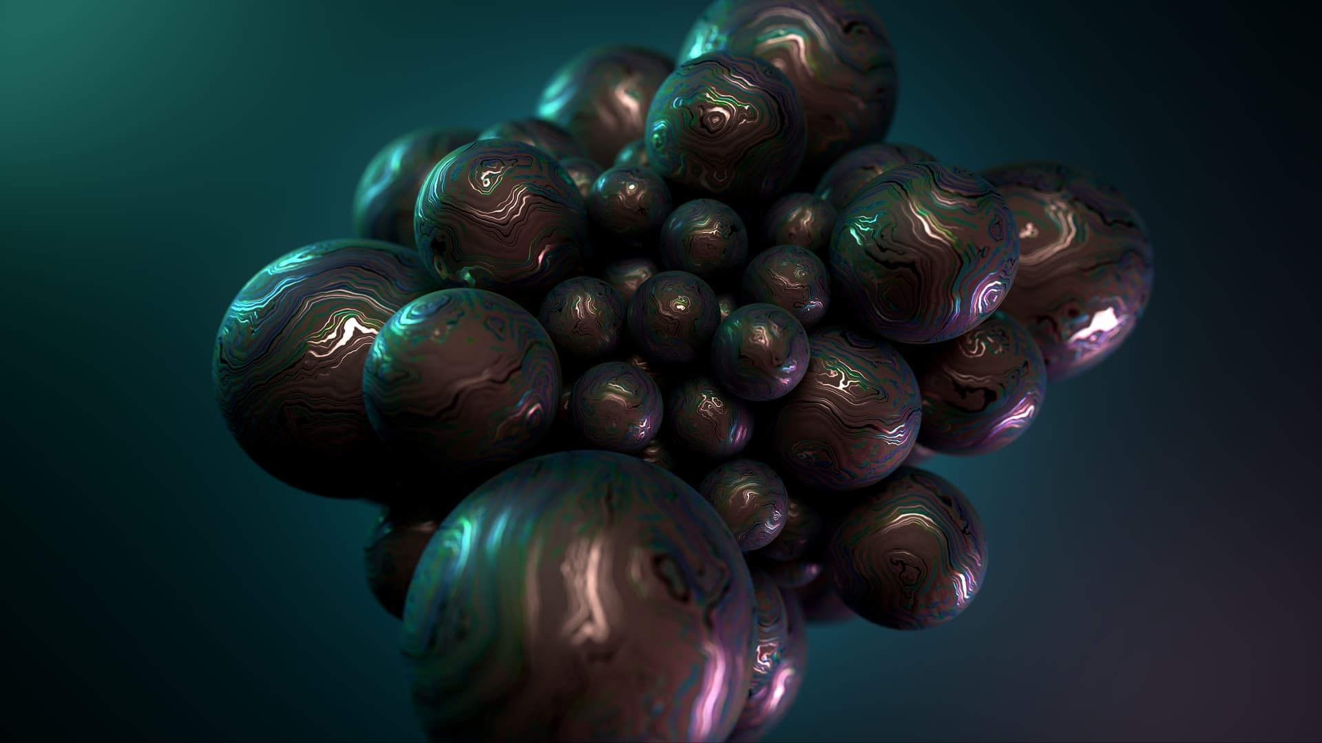
Spheres remind me of 3D fractals for some reason.
With these too, look neat, and I see no major flaws.
Hello @arty.buzz
That’s a lot of work and looking at them each
1- Canyon = prefer light image + dark too dark.
2- Flower = both good, light image looks to be under black light or full moon that’s a ++, the dark image good contrast and good balance of colours for viewing.
3- Hexworld = That is just crazy, light image looks to me a landscape/mountains and the dark image looks like a crazy beehive thing.
4- Julia = both good, in each one the contrast between the light and dark parts is very well done.
5- Spheres = light image preferred only because the dark image seems to lose focus on the front sphere or do I need to go to OPSM and book an eye test.
What image is my favourite that’s No1 Julia both yep both and I do like No3 Hexworld again both images.
@artytux you’re right about the focus in the spheres pic, actually both light and dark versions have the exact same depth of field settings. This is intended to give a sense of depth as the objects in the scene get progressively out of focus the closer or further away they are from a given distance to the camera.
In a weird way it also makes things appear smaller e.g. make a real city look like a miniature.
It’s tricky though give it the right balance. Some people like a lot of it, some not at all…
@arty.buzz in the link you provided yeah can see where your work idea comes from OK.
Coould be because as I’m getting older I was thinking is it my eyes ah no it’s artistic license phew .
Hopefully all our collective comments have helped you towards deciding (even a little bit).
All the best to you and for your artwork.
And to give my opinion on all of them:
I think they are all wonderful.
I don’t understand why it doesn’t have more likes.
For me, all the 5 propositions are just really really good.
The first one kinda look like an OSX background. But is really cool. I think that the dark mode looks really cool too.
The second is also very clean and beautiful!
The third one is really original! I like the transition in season between the light/dark theme.
The fourth has a lot of abstraction, and I find that really cool. The transition from dark to light is nice!
The fifth has a really nice look, and I also like the transition between light and dark.
Its sad that you can’t post the five
Is it possible to have it in a higher resolution please ?
TL;DR
I plan to do so.
The longer answer:
My intention with this is to help me decide which ones I’m submitting in the end.
The competition rules state
While there will only be one winning selection, other submissions may be included as optional wallpapers in Plasma 6, or used in future releases.
So I’ll wait and see what gets included (if anything) and will make the rest available. Most probably in https://store.kde.org/ since to my understanding that’s where one can get wallpapers directly in KDE over the desktop settings “Get New Wallpapers”.
Indeed. I would like to complete the 4 seasons, that would be nice. At some point I even considered making an alien planet one, you know, with weird artifacts instead of trees.


