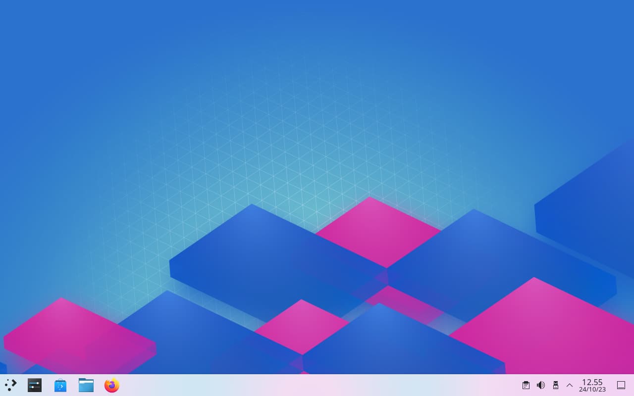
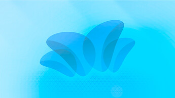
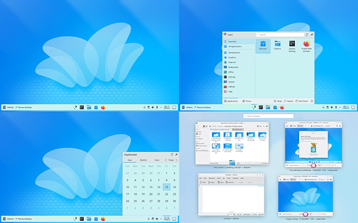
I’m a sucker for that kind of bright blue.
my pardon, i dont quite get what you mean and which wallpaper ?
thanks for your response though, im just realized depending on the monitor, serenity wallpaper can get light bluish or gentle blue. just spot it between my laptop and tv monitor.
though, i think brightness and slight color matters can be easily resolved in the end with GIMP.
refresed serenity gitlab page
added all variant preview in submission gitlab pages
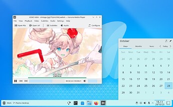
added a bunch of useless screenshot in online gallery ![]()
added submission 2: Joy
calm and vivid, a wallpaper that present joyful vibe. variation of breath style.
gitlab page: submission 2
quick download: joy wallpaper
screenshot galleries:
- light: joy-light — Postimages
- dark: joy-dark — Postimages
- twilight: joy-twilight — Postimages
demo video for fun: https://youtu.be/wtVqMoqignw
phone mockup:
tidying up repos
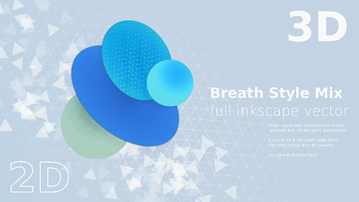
add new folder /src/design . contains material for artist and developer who want to explore and discover the concept of breath style further.
here, just a small example of breath style implementation in artworks.
moving to work into submission 3:
there is a lot to be redone into submission 3 so i think it will need more time. until its done, as my usual tendency to post unrelated and useless artwork just for fun, here a spoiler ![]()
you really are a genius in design!
thanks, that very kind of you @FrankoPV , im just a bit older and more experienced thats all.
im more jealous with other young artist submission whose already great at their time.
Its KDE 6, but very nice!
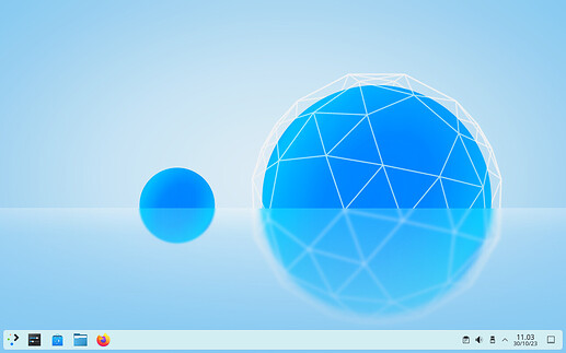
you might predict that submission 3 is the big lonely blue ball but no because it had its own son now to help company and give balance to wallpaper ![]()
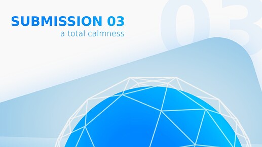
added submission 3: Bliss
calming and soothing, help relieves all your stress away. a super clean wallpaper.
gitlab page: submission 3
quick download: bliss wallpaper
screenshot galleries:
- light: bliss-light — Postimages
- dark: bliss-dark — Postimages
- twilight: bliss-twilight — Postimages
demo video for fun: youtube
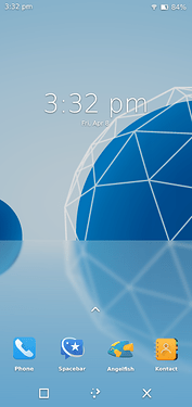
phone mockup:
added many more samples in /src/design
[!] replaced submission 2: Joy
Joy is somewhat similiar to serenity so i want to present a more novel design. joy will still be accessible in unreleased folder.
added replacement to submission 2: Red Island
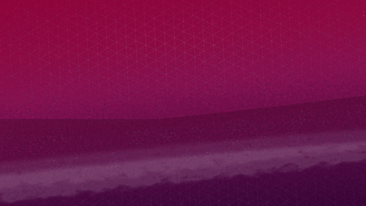
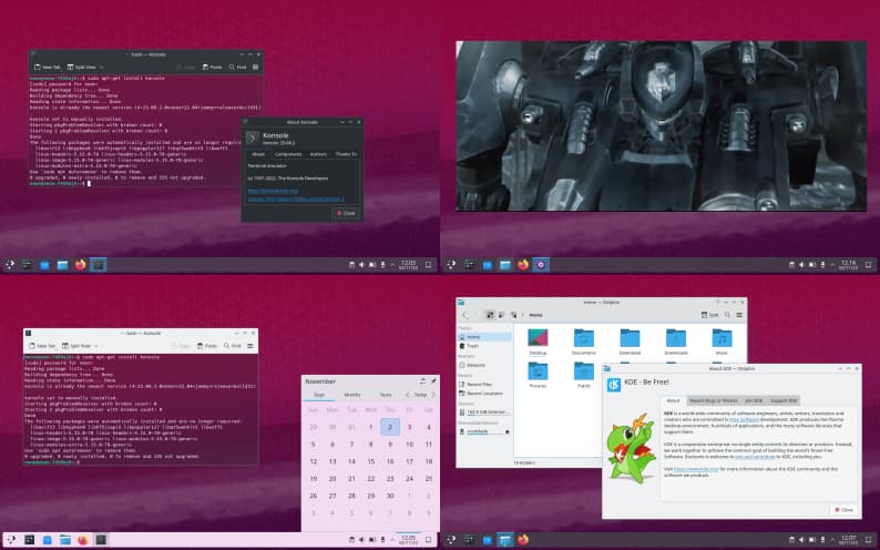
the brave and calm shade of red velvet combined with KDE peaceful blue accents interface. a realistic scenery breath style wallpaper. gitlab page >> quick download >>
unified wallpaper that goes nice with all color theme
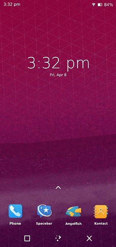
great for phones too
and introducing the first ever video trailer using breath style:
hope you like it ![]()
It is really good, looks professional.
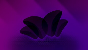
I really love this design! Perhaps the best so far. It’s just the dark version that leaves something to be desired. It’s not near dark enough. I wonder if a navy or dark purple background would work better.
thank you all, alternate variation preview will come in revision folder
red island its inspired from plasma 5.27 mountain wallpapers, its nor light nor dark enough.
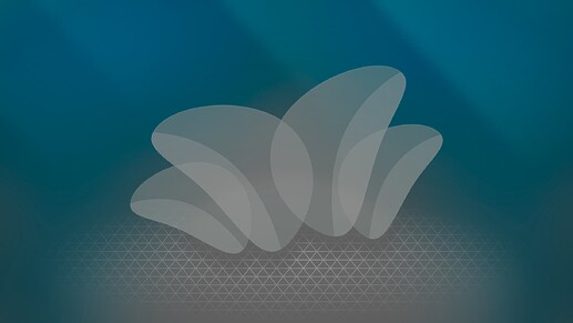
Big fan of this Serenety wallpaper. Would love to see a dark mode version
Edit: I noticed the dark version; I don’t think it’s as strong as the light version though. Serenity-light seems in line with “Breeze light” design language, but Serenity-dark doesn’t feel consistent with “Breeze dark” very much. The foreground elements also pop less than the light version, and I find the combination of colors unpleasant in comparison.
I imagine a dark version would be better with the centerpiece still being white or light grey, on a very dark grey background, with blue lighting from above causing faint highlights throughout.
Hope my opinion isn’t discouraging. This is still my favorite wallpaper so far.
thank you.
as long people communicate in good manner, im always happy to take or consider any opinion or suggestion.
here i made a base image as you imagine.
from there you can download it within the forum gallery then use GIMP to further suit your tastes. maybe something like this ?
there is also past revision. come take a look maybe you will find your liked ones already:
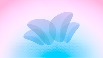
some of my personal favorite:
summer
pastel
solarblue
darkpurple
unfortunately my holiday is over, i might be away for a while.
lets also wait for what judges had to say.
have a nice day ![]()
![]()
ps: in the end, “if” serenity does not get selected, im still hope it can be included as extra wallpaper or maybe even for future release.
the pure blue feeling reminds me of my childhood where computers used to be blue interface everywhere: kde 3, macos aqua, gnome 2, solaris, and the ultimate win 7 aero. they all truly gorgerous and memorable past.
i still think blue is the best and pleasant color for technology and would love to see kde in plasma 6 back to its blue roots for a while.
just highly opinion of user who had lived trough 1999 computer era ![]() - biru
- biru
That is great work and this style is clean and professional looking, the looking for a logo thread should be so lucky to have you helping them.
Agree yeah don’t know if he has time to give it a try
i see what i can do, but most likely not right now.
that “looking for a logo threat” is this i presume
look forward for it later ![]()
This is almost exactly what I envisioned. Thanks again for your work!
