
Hello, everyone first time here. I need some help customizing my Linux because I don’t know what to add or to make it look good. I’ve been using it for a month. Please go based off my wallpaper colors, if you can’t, I have the hex codes to match with it. Ty for much!

What looks bad to you that makes you want to change it? Identify those things first, then look into the options for customizing their appearance.
If nothing looks bad to you, maybe you don’t need to customize the look at all! ![]()
It just feels like Windows which I don’t like at all. I want it to take it to the next level so it stands out from Windows.
Several months ago I wrote on Reddit that KDE used to have a wallpaper setting that allowed you to change the brightness of a solid-colored background, like that one. There is no such option in KDE’s settings anymore.
I would like to see that option in the settings again. You could choose the color with a color picker and the brightness could also be adjusted to how bright the top edge would be, for example.
I used to have green as the color. And it was like a wide football field and the brightness came from above. ![]()
Of course, it is possible to do that as an image. But I think it would be good to have the stepless brightness change in the settings, so there wouldn’t be a need for a separate image file. It has an annoying feature: the icons on the desktop have black background text.
Background as an image has an annoying feature: the icons on the desktop have black background text.
I do not know if you are aware of the KDE Store but it has many options to choose from. You can also access this via the system settings:
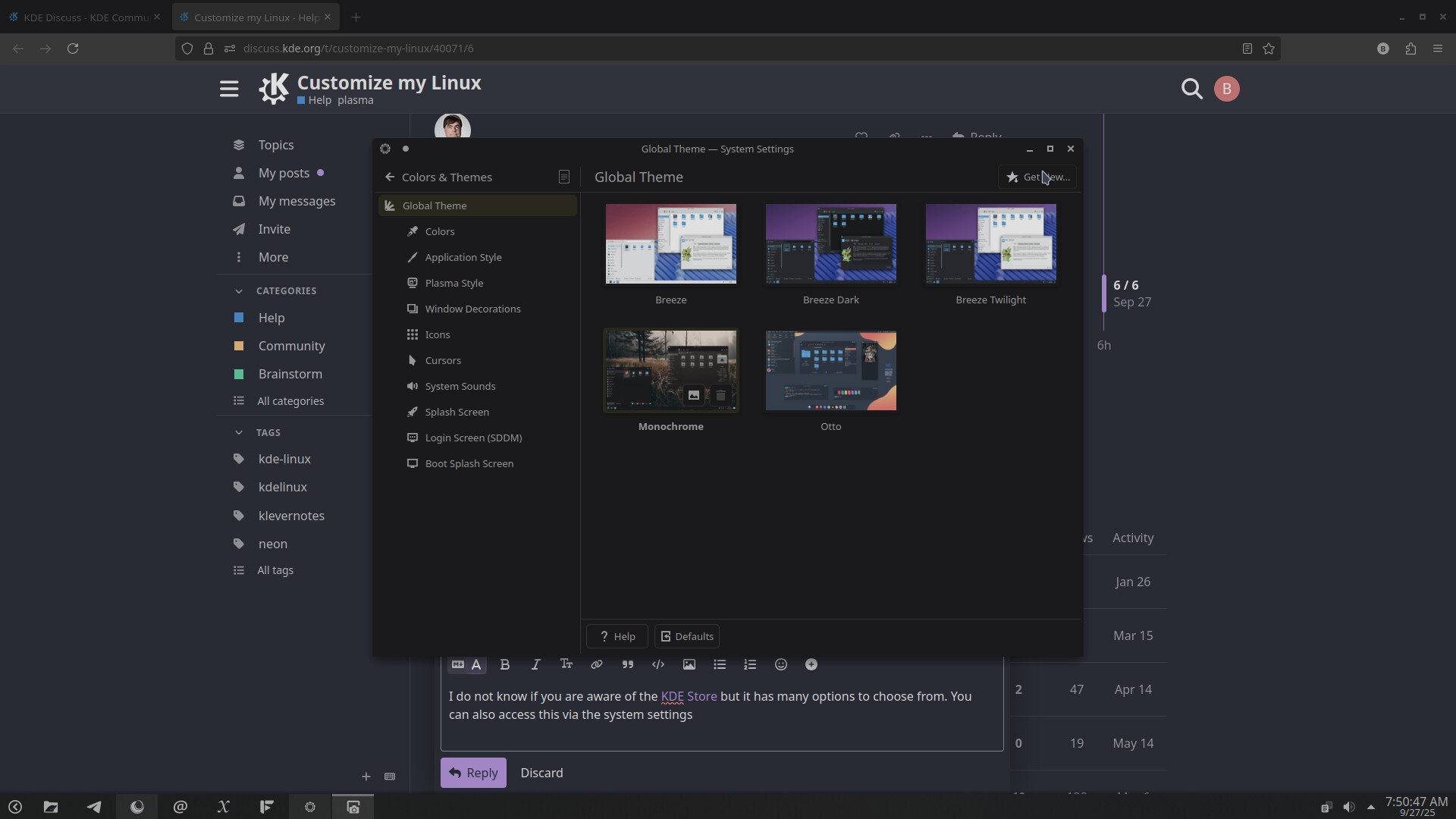
I used the Global Theme settings as an example but you can do that for all of the setting options for Appearance.
If you want inspiration from our lovely community, check out Share your desktop!
@ngraham is also correct, think about what you want to change and look at the options.

What’s the difference between Pling and KDE Store, if there is any?
Great question. I’ve wondered that as well.
Aside from the banner (see KDE and PLING links below), there doesn’t seem to be a difference. Which begs the question… WHY?
Pling hosts and runs the “KDE Store”. store.kde.org is basically just a KDE-themed front-end to pling.com.
Don’t know if it helps to get rid of the “feels like Windows” vibe.
For my workflow, I usually move the panel just to the left or the right, pin my most used programmes to it, set some tiling layouts I can use with shift or use window rules to set window positions and sizes.
For maximized windows I disable the title bar and use another small doging panel in the upper left or right corner with a window buttons plasmoid.
For switching virtual desktops there’s a another small dodging panel at bottom center with the pager plasmoid. [https://discuss.kde.org/t/share-your-desktop/490/450\\\]
ymmv
i myself sorta ‘like’ the default windows vibes kde has vs say gnome. that said you could do a number of things , you can add widgets to your desktop , you can totally wipe the default panel and just add what works for you . even segment them out into small separated panels
personally i kept mine mostly default but pinned the stuff i use the most to it and added a 2nd tiny panel to the top right that hides away unless i hover over the area which i added a couple things i Sometimes but less often use like a calculator and system monitor to it , i also Had kde connect ( redundant now that its by the clock) and spectacle ( screen cap thing) which doesn’t seem to work more recently on there for some reason.
if you don’t like the sorta start menu style default application launcher you can right click it to select alternatives my mother prefered gnome for a bit so when she switched to kde recently i installed the ‘plasma drawer’ for her to use as an alternative.
aside from that i guess i’d just say what others mentioned and just look into themes you can grab .. i myself use a mix and match instead of a single global theme. mine is ..
colors: amethyst
application style: breeze tho i once in a while eyeball fusion and oxygen instead
plasma style: shades of purple ( previously i was using gently)
window decorations: breeze . there are some i prefer but they have those circle buttons for min/max/close so i get grumpy and don’t use them even if i prefer other aspects ( i’m too lazy to go in and modify them)
icons: vivid dark icons
cursor: oxygen neon large
system sounds: oxygen
imo i think your colors and icons can make a big difference , icons in particular . my mother uses a neat sorta cartoony package buuf for many desktops that has a totally different feel than mine which are more wire/graident looking and my fiancee has a different set thats more like circles with logos in them it gives a totally different feel. i wanna say its storm in the share your desktop thread that makes some as well that are pretty great tho simplistic , sadly the ones i like are missing some applications i keep pinned so i never opt for them even tho i like the designs.
aside from that idk , i don’t think i’d ever be able to go to such a flat/bare wallpapper as that personally .nothing wrong with it but i just have a slideshow of wallpapers i’ve used for years and selected just the ones that fit my purple and blue sorta scheming i have going .
for you i might recommend checking out gently and iridescent round for youur plasma style , i think if you’d Like to match your blue it could go well and for a color scheme there at tons of more blue varieties that could work great.