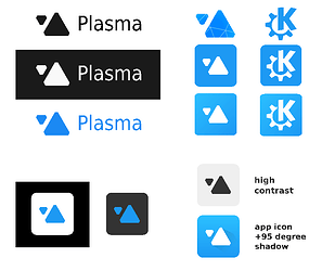
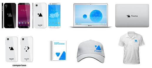
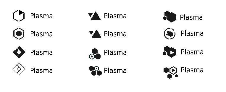
how about like this ? ![]()
ps: im not intended to competing with others or anything, this kind of thing is just part of my hobbies during my free time.
FULL:
about breath style >>
LITE:
UI:
SCALABILITY
MY OPINIONS:
regarding logo and brand representation
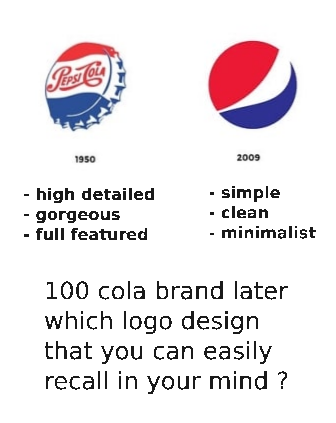
its just a symbol for people to easily remember and interpret the whole thing behind that logo creator. so a logo doesn’t need to symbolize its exact product respectively. ex: apple is a food used for a computer logo. some logo also just a typefont like samsung.
a good logo and brand identity
should be simple yet different from others. the simpler the more easily and quickly for people to remember. the rest is to maintain a good impression behind that logo’s product. ex: windows logo is literaly just four square & adidas is just a three stripe.
making it looks professional despite created by communities
this topic requires long explanation but i believe it boils down to represent the wisdom of eldery just like parents habit:
- make things simply and easily as possible.
- love to be organized, clean, neat and tidy.
- someone who really knows what they do and what is best.
- someone that always think carefully, always prioritize long term decision.
use as design guide and you get that corporate vibe feeling (especially no 1 & 2).
CLOSING NOTES
obviously all of those is is just my opinion. for that i had provide other samples as well, might find something you like.
SOURCE:
please fell free to adopt, reuse or modify my work
samples and mini test panel svg on gitlab
nb: all of this concept is still just a quick, unpolished and non precise model.
