Hi,
There has been quite a lot of merge since last time lots of minor tweaks/bugs fixes but also some big changes. Let’s take a look a this!
What’s new ?
Tweaks/Bugs fixes
I’m not going to list and explain each one since there are more or less 20 of them.
-
The wikilink regular expression (used for the linked note) was not done correctly, which meant that sometimes it grabbed things it should’t. For example a bash if the statement (
if [[ -z $foo ]]; then) inside a block of code could have been interpreted as wikiling. This MR fixes the problem. -
Tweak table dialog + table rendering
The number of rows generated by the table dialog was offset by one.
There were sometimes ‘pipe’|inside of empty cells.
I was not a big user of tables before this, which is why I did not notice the issue
-
Regex: corrects translation errors and simplify some
I won’t go into to much details for this one. The important things are:
- The “indented code block” was removed, it was inferior to the “fenced” one and was ennoying to deal with.
- Embeded html tags finally works !!!

-
Many more…
UI
-
Plugin toggler now use Switch instead of Checkbox
I’ve read something about this that pretty much said the following
Switches allow instant change, checkboxes require something like an “apply” button for their modification to take effect
This makes a lot of sense in my opinion, hence the change.
See UXTweaks - Checkbox vs Toggle Switch: When to Use Which for more info
-
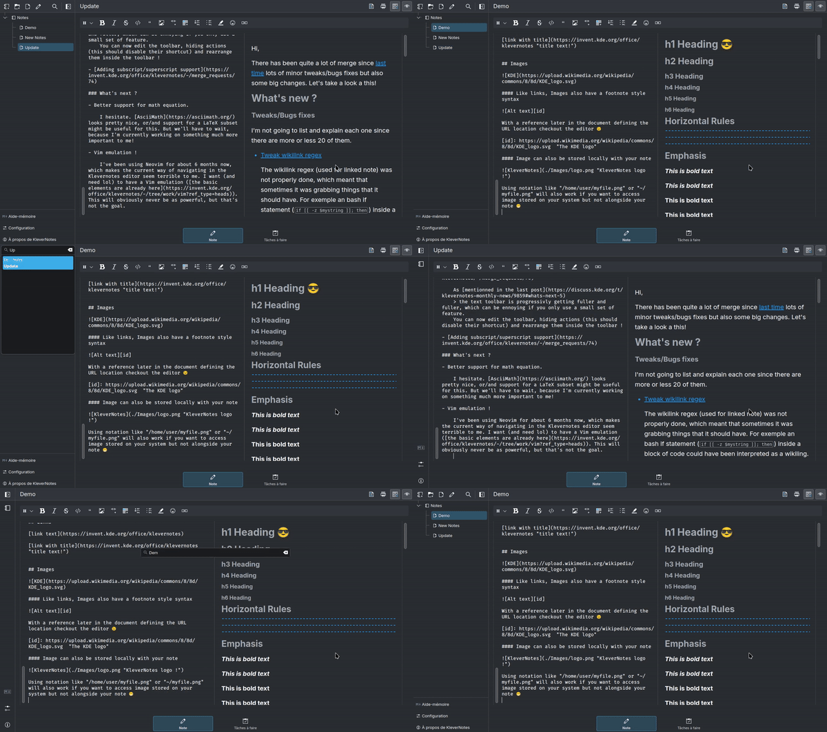
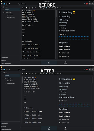
Reorganize EditorView visual layout
I kind of followed the frameless style here (kind of by accident). The editor UI was, in my opinion, a bit cluttered. This removes the “dark” background in the editor/preview and rearranges the scrollbars. This, in addition to the reduced sidebar, makes it easier to focus on a single note (almost a “zen” mode).
Note: The icon were still a bit messed up at that time, see next point

-
With the changes happening to Breeze icon, some of the icon in the app were slowly changing shape/color. Using symbolic icon should ensure that everything stay black and white.
-
Possibility to collapse the sidebar and Sidebar more improvements
On the desktop, the sidebar can sometimes be quite big and distracting. What’s the need to view the whole Treeview when you’re focusing on a single note ? The sidebar can now be collapsed to only take a small portion of the window !
For some time now (nearly a year), you can search your notes by name using the magnifying glass icon at the top of the sidebar. However, there was no shortcut for this

This fixes the issue, using
Ctrl+F(might change toCtrl+Shift+Fin the future), you can now trigger the search bar.The fact that the sidebar can now be collapsed sometimes makes the position of the search box a little weird; it will now appear in the center of the window when you are in “collapsed” mode.

Quality of life
-
You can now choose space instead of tabs.
Using tab/backtab on multiple lines will apply the effect to the whole block.
When pressing return to get a new line, the new line will now follow the indentation of the previous one. It will also add a new list item if the previous line was one. -
Without going into details, this makes the preview reload faster/smoother. I especially saw a big difference with notes that use a lot of highlighted code.
-
As mentionned in the last post
the text toolbar is progressivly getting fuller and fuller, which can be ennoying if you only use a small set of feature.
You can now edit the toolbar, hiding actions (this should disable their shortcut) and rearrange them inside the toolbar !
What’s next ?
-
Better support for math equation.
I hesitate. AsciiMath looks pretty nice, or/and support for a LaTeX subset might be useful for this. But we’ll have to wait, because I’m currently working on something much more important to me!
-
Vim emulation !
I’ve been using Neovim for about 6 months now, which makes the current way of navigating in the Klevernotes editor seem terrible to me. I want (and need lol) to have a Vim emulation (the basic elements are already here). This will obviously never be as powerful, but that’s not the goal.
As always, don’t hesitate to give me your opinion, I will be happy to discuss ![]()
Link to the repo: Office / KleverNotes · GitLab
Link to the last post: KleverNotes: Monthly news

