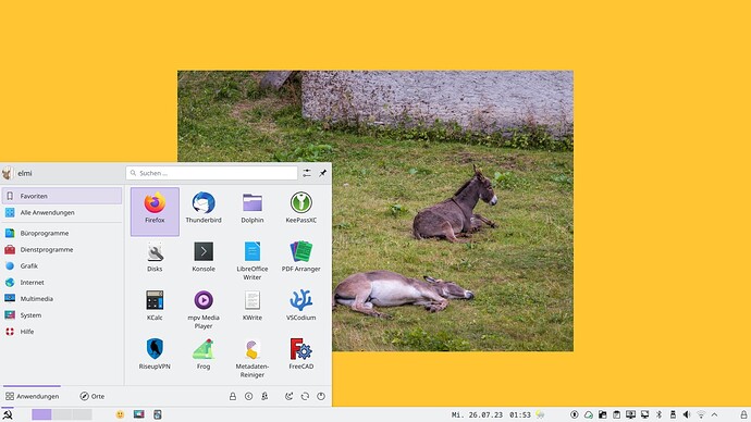
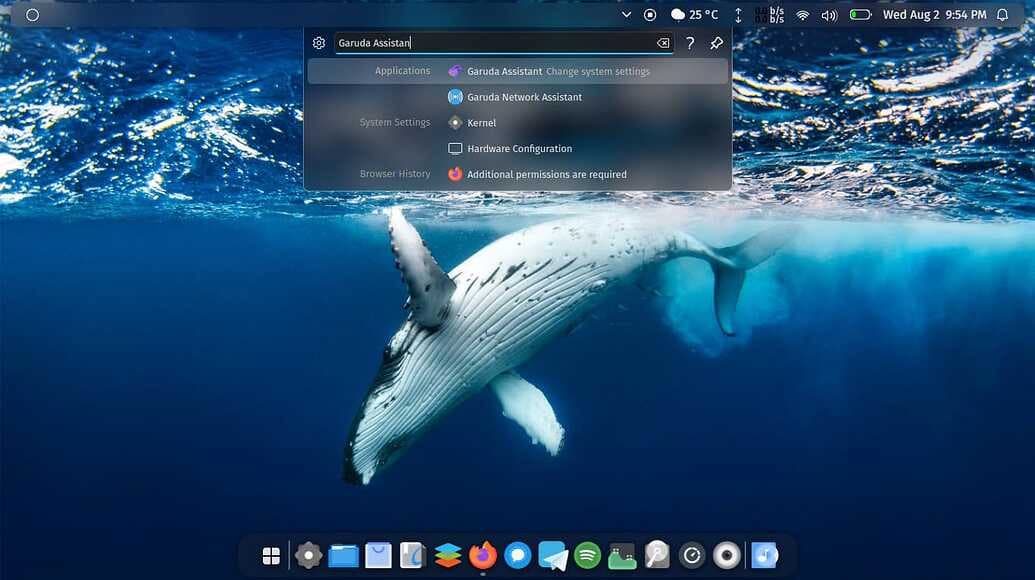
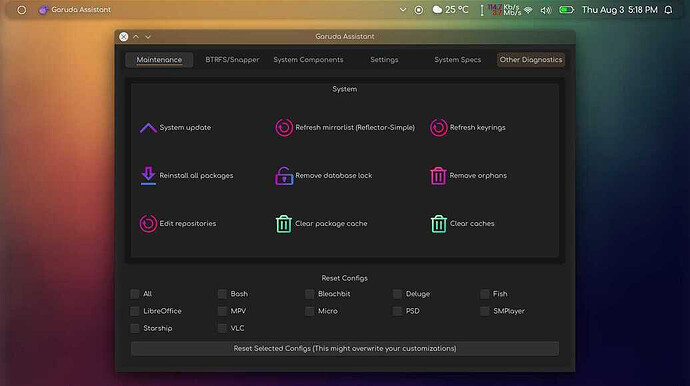
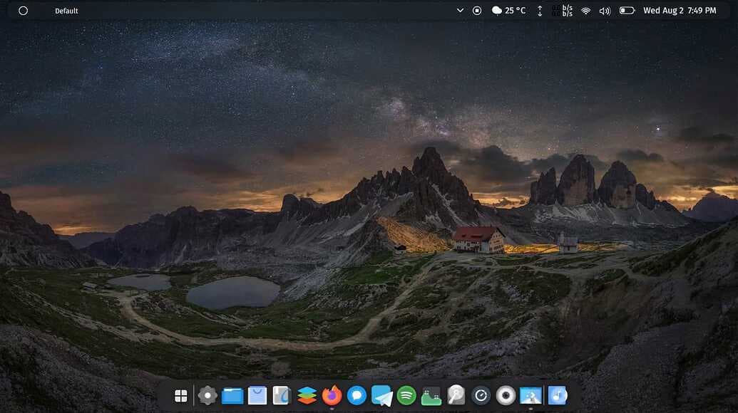
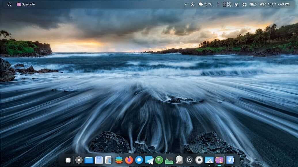
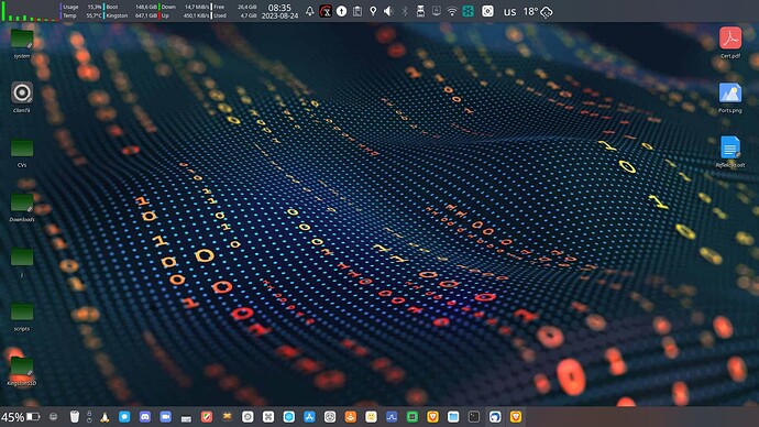
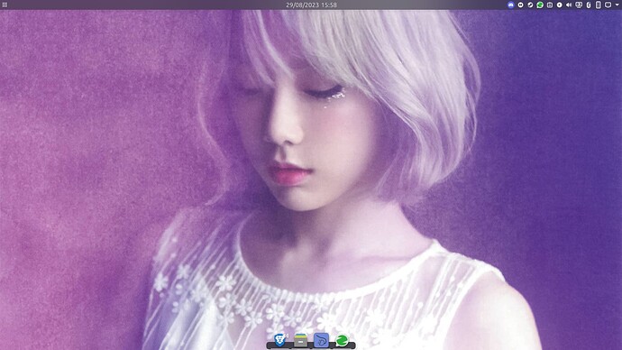
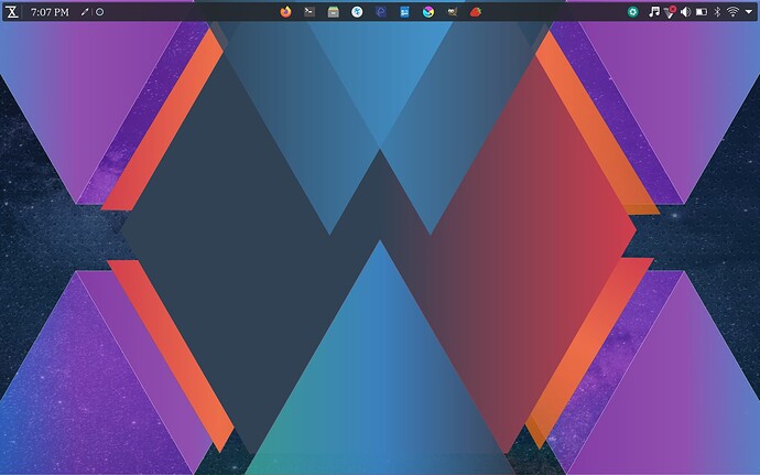
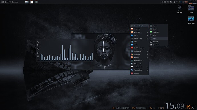
opaque, non-floating panel with a lot of spacers, no font-hinting, purple as accent color, Noto Sans Mono for time display, background image and menu icon from Wikimedia Commons
What’s your icon pack?
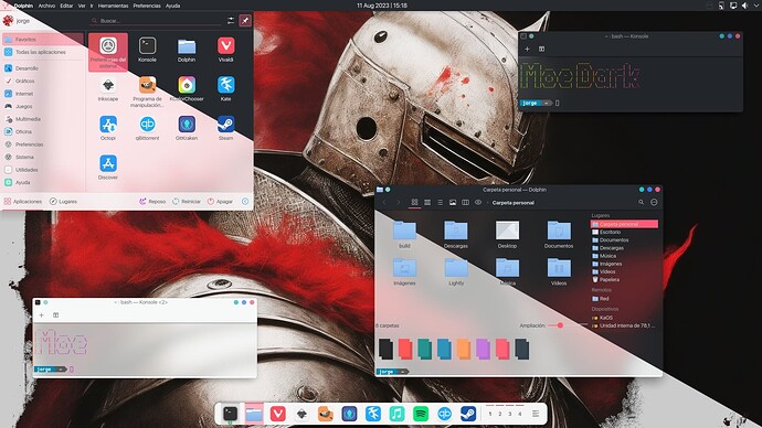
Updated Moe and Moe Dark Themes.
Links to the kde store on my blog https://seduccionlinux.wordpress.com/moe-moe-dark/
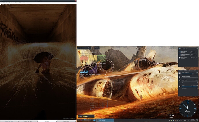
My desktop is pretty much straightforward - the non-standard stuff is just using Breeze Twilight theme (dark plasma, light applications) with a Breeze dark window decoration (as can be seen in the open Konsole) - the light Breeze window decoration doesn’t have enough contrast between active and inactive windows for me. You can also see that I like my terminal on a vertical screen and I like it transparent.
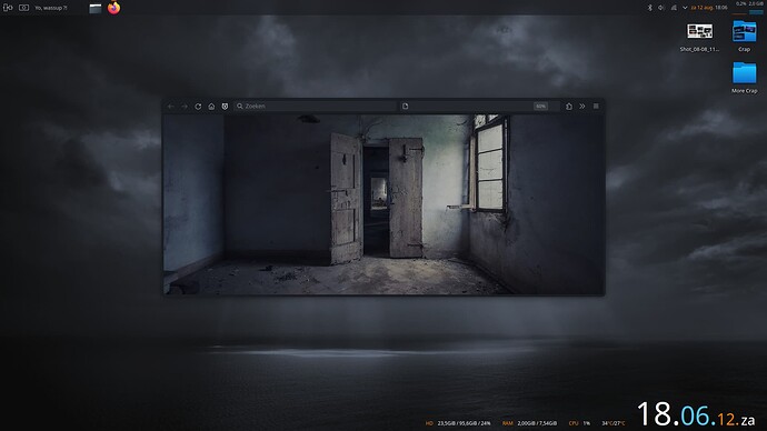
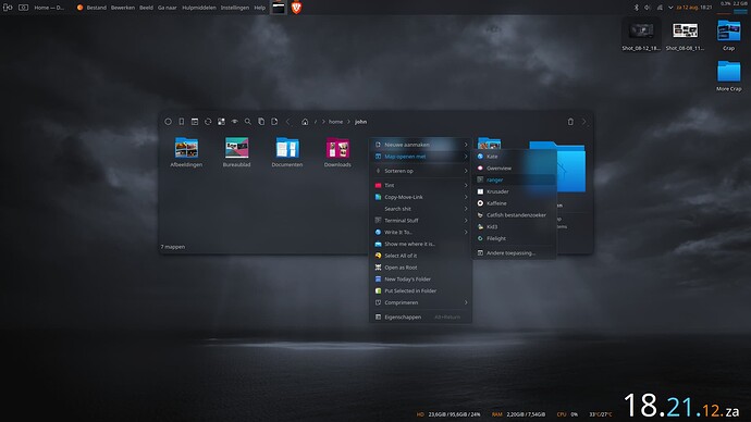
Other than that, the primary screen has a floating panel (which I hope will be a default for Plasma 6, and a bunch of widgets to help me work:
- Top left: energy center - command widgets showing CPU power mode, CPU frequency and system power draw, then a bunch of CPU meters.
- Bottom left: another set of meters (the system fans sensor isn’t available on my new laptop) and another command widget, this time showing the category of the current desktop wallpaper, and its rating - my wallpaper is a slideshow (the main screen uses Variety which also shows wallpapers from internet sources in the slideshow), so I like to know what I’m looking at.
- Right side: bluetooth devices, so I can quickly connect and reconnect headsets as needed by just hitting CTRL+F12 to show the desktop; power control panel; main clock and clock for another timezone where I have people I often conference with.
On the secondary screen you can also see the command widget showing the category and rating of that wallpaper (here I just use Plasma’s slideshow plugin with a collection of local vertically oriented wallpapers), but other than that - the vertical screens are devoid of widgets. At the office I have an additional vertical screen for more real estate, but it looks basically the same, except for a different wallpaper.
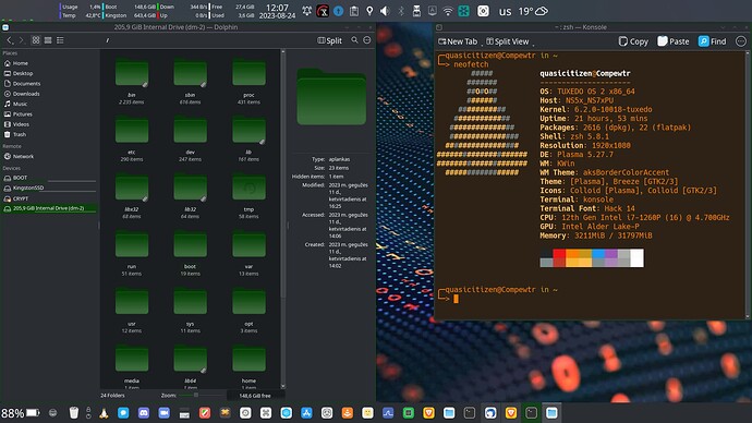
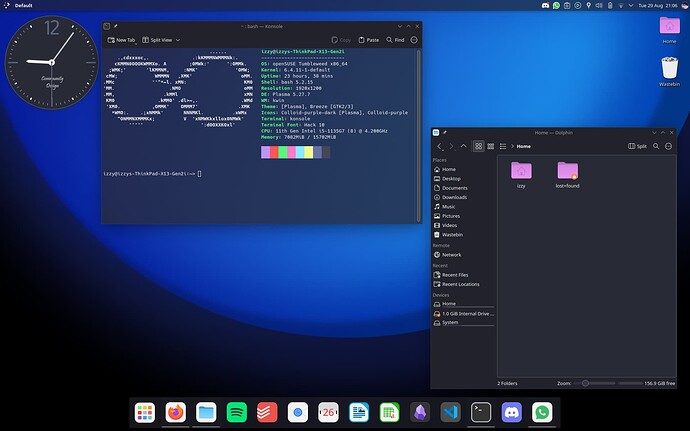
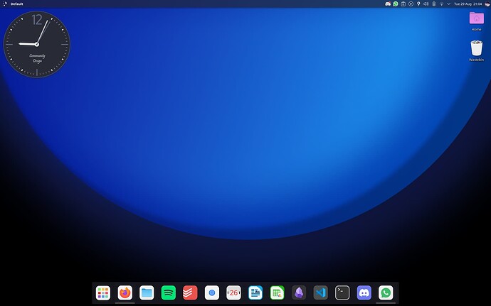
With Konsole and Dolphin open. Kinda going for a macOS layout while avoiding copying it outright.
Also have the Active Blur wallpaper plugin, and the wallpaper is Neptune, which I created for the wallpaper contest (not intended to be self-promo btw). I also use the KWin Script “Panel Autohide” to have an intellihide-style panel for Plasma, as Latte Dock is unmaintained.
oh wow… this is so blursed
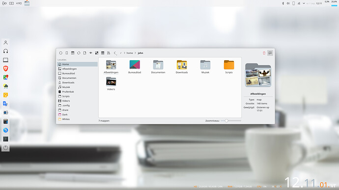
MX. This one’s default breeze, but with a focus on a lot of custom xdotool/scripts corner actions ( six mouse actions over two corners etc…) and custom desktop applications. Clean and out of the way kinda…
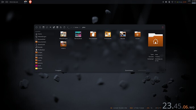
Other than that, same ol’ same ol’…Usual colors and default darks.
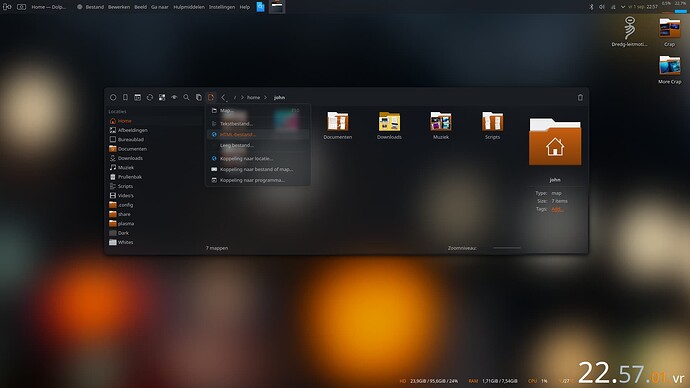
Those first ubuntus. I remember those warm earthy colors and how they warmly contrasted with the then windowz machines. That brown-ish, orange-ish earthy look has long since been abandoned but I think it still has this cognac and a cigar kinda vibe in a Sweet Mars, Dracula or Garuda neonlights craze era.
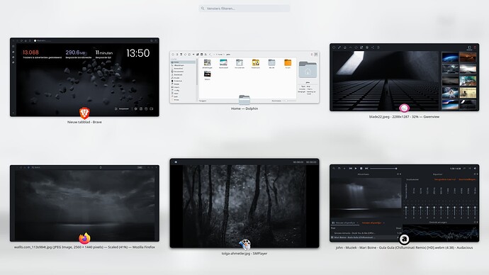
And for the ol’ geezers that remember the stones wallpaper… ![]()
this looks so comfortable!
openSUSE Tumbleweed, on my Tuxedo InfinityBook Pro 16. Featuring one of my
submissions to the Plasma 6 contest Journeys
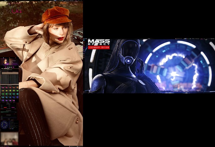
Decided to make the ultra wide my main monitor + putting my 4K in portrait mode. Totally loving it!
And it made my room feel roomier.
