The current implementation of tabs in settings is bulky, slow to use and annoying.
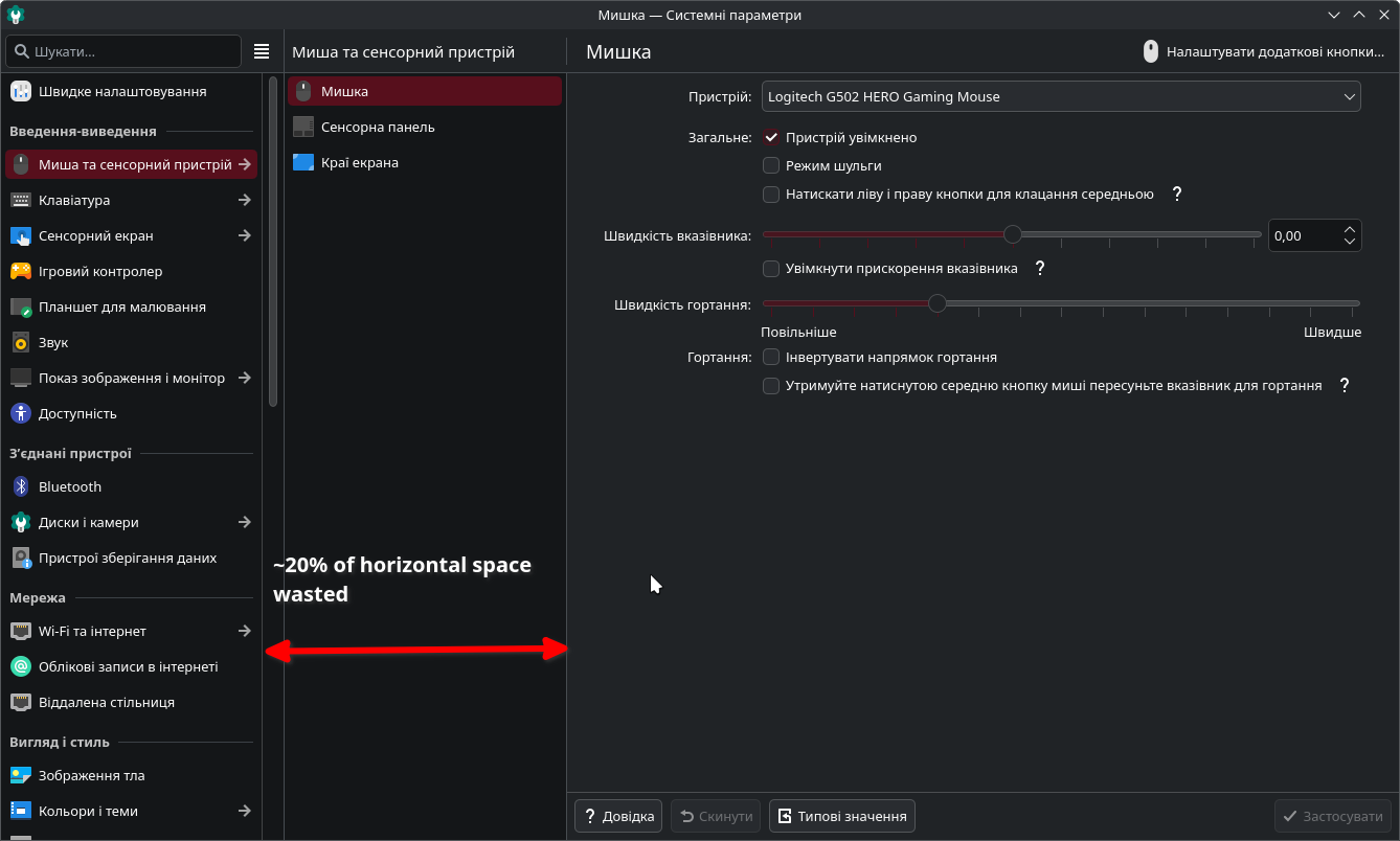
There are 2 modes, I either have to keep the window this size for the full one:

Which is like 50% of my screen.
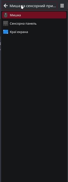
Or I can make the window smaller and get this abomination:
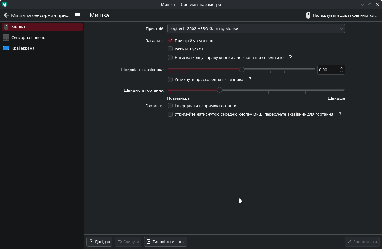
Where each time I want to see other settings, I have to reach to the top right for the «Back» button.
In both modes, to navigate I have to flick my cursor all around the left side of the window. When I look for settings/change tabs, my cursor is here:
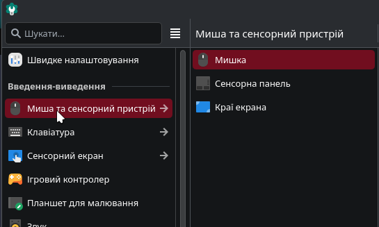
But if I want to change tab in a group, I have to move it to the right:

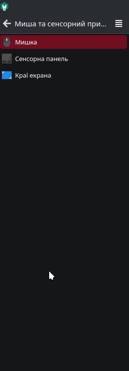
To then move it back to the left because I didn’t find the setting I needed. It’s also even worse when the group is not at the top of the main list (have to move my cursor to the right and all the way to the top to change the subgroup):

And in compact mode, I can have my cursor all the way at the bottom:
And have to move it all the way to the top
Just to move it back to the bottom (to change to the next tab).
Also, there’s an issue with keyboard navigation. Guess where the selection is:

I also don’t know. Maybe it’s on the left and I can move to other settings, maybe it’s on the right and I have to press the left arrow to move it to the right to go on. The change of horizontal selection also doesn’t have any visual feedback, so I don’t even know if my left arrow press registered or not until I try moving up/down.
And it obviously wastes a lot of space
So, my suggestion - make it a tree view. For example Rider:
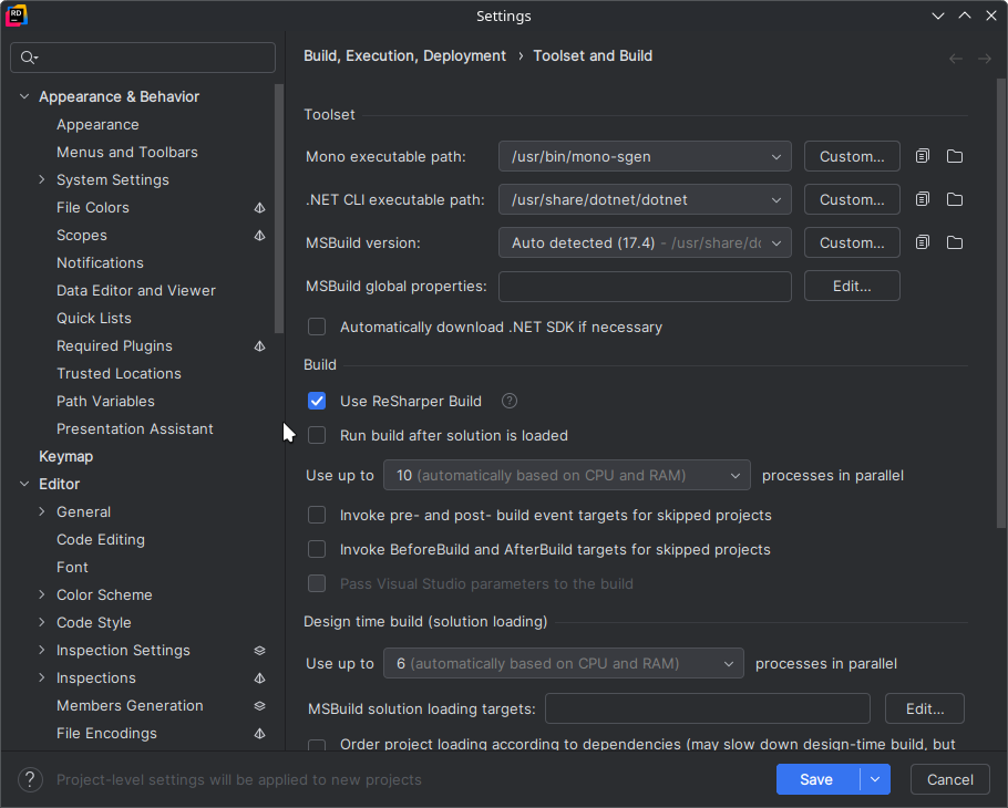
Concept for the settings app: The settings app should use a tree view instead of an oversized hamburger menu - #15 by Damglador
It’s compact, much easier and faster to navigate with both keyboard and mouse. And the window size doesn’t affect usability or the way you use it in general.
This issue was bothering me probably from the first time I used the settings.
Edit: The current implementation would actually make sense if there were a lot of tabs in a group, in which case a tree view may be a bit worse. But currently there’s 2–3 tabs in a group (with the exception of the customization group), so the second sidebar always has 80%-90% of blank space.
And the horizontal space wasted on the second sidebar matters even more for tabs that have a third “sidebar”, like the network tab with the list of networks, app permissions with the lists of apps, which feel very crammed even in the window size on the screenshot.